Dev Blog

Particle Systems and the VFX Graph in Unity

February 27, 2019

Particle Systems in Unity 2018 and Later

Particle Systems and New VFX Graphs

I originally intended to look up new tutorials for particle systems in Unity to get a better grasp of the differences in the newest version of the Particle System editor. This was because a lot of older tutorials had the old setup so some of the differences made it hard to follow. While I did find one newer particle system tutorial using the editor, I stumbled upon the Visual Effects graph which appears to be a node/graph based editor for creating VFX new to the latest version of Unity, so I gathered a lot of tutorials for that. Several of them are from Brackeys as well, which is someone I follow often for basic Unity tutorials.


Youtube – Everything to know about the PARTICLE SYSTEM

By: Brackeys

This is the video just going over a lot of the basics of the Particle System editor. Since this was only about a year old I hoped it would cover some of the weird differences I run into, like shaders for particle materials.


Youtube – Visual Effect Graph – Realtime visual effects In Unity 2018.3

By: Unity

This is a quick video from Unity that just shows off some of the basics and capabilities of the VFX graph.


Youtube – FIRE AND SMOKE with Unity VFX Graph!

By: Brackeys

This is a nice example tutorial by Brackeys on using the VFX graph to create a fire/smoke effect.


Youtube – MILLIONS OF PARTICLES! – Unity VFX Graph

By: Brackeys

This is another Brackeys tutorial using the VFX graph that just focuses on doing weird effects with a very large amount of particles.


Youtube – MAKING VISUAL EFFECTS IN UNITY 2018.3 | Beginner’s Guide: VFX Graph

By: Sykoo

This is a longer look into the VFX graph and a lot of it’s capabilities from the very beginning.


Game VFX – Basic Fireball Projectile

STANDARD

February 26, 2019

Fireball FX in Unity

Unity 5 – Game Effects VFX – Fireball Spell / Projectile

Gabriel Aguiar Prod.

They start by creating a basic fireball shape in Photoshop. They used the brush presets to get a nice, fuzzy and flowy effect for drawing this. I went with Round Watercolor since that seemed pretty close to what they used. They also turn the opacity down to allow for increased color on the overlapped sections.

In Photoshop I had something selected on a layer still so when I tried to draw it would only draw in that selection, so that took some time to figure out that issue. They like to use white and just color in Unity. I also used some black to hedge out some of the white values, but not sure if that will create issues in Unity later.

We started creating the Particle System in Unity. We begin by creating a new material that they suggest changing the shader to Particles/Additive, which is a legacy shader now. I tried Particles/Standard Surface, and set the Albedo map to our PNG file instead of dragging it into a texture box (what is done in Particles/Additive).

In the Particle System, we turned off Shape. We edited 3D start size with random between 2 constants. This lets you set bounds that it could scale on any axis. We changed Emission Rate over Time to 1.

We added Rotation over Lifetime. You turn on Separate Axes to get access to more axis options. You also need to change the Start Speed to 0 so it stays in place and solely rotates. You raise the emission rate now to have several spinning at once, and alter the opacity to get the desired visual.

We changed the Render Alignment to Local so it doesn’t always face the camera.

You need to find the balance between: Start Lifetime, Opacity, and Emission Rate over Time. For Colors you can use Start Color/Random Between 2 Constants, or Color over Lifetime. Color over Lifetime gives better options with a gradient functionality.

We added another particle system as a child to the original one. This used another Photoshop image as a texture that was just a small ball of light. This would be used in the material (another Particles/Standard Unlit) of the particle system, as well as for its trail.

This particle system used the following effects: Velocity over Lifetime, Color over Lifetime, Size over Lifetime, Noise, and Trails. The trails add a wind-like light trail effect to each particle that adds a lot to the system. The noise makes trails curvier and more random/organic looking as opposed to always firing in straight lines.

We then added a duplicated version of this secondary particle system but removed the noise and random velocities to just have it travel in a straight line directly behind the overall particle system. Finally we added a Light to the main particle system. This is done by creating a light prefab and dragging it into the Light section of the particle system.

SUMMARY

  • Use white colors for FX for Unity so you can color them in Editor
  • In Particle Systems, in Renderer, increase Max Particle Size (i.e. 3) so when you get closer you don’t get weird problems
  • Adding Noise to the particle system can make it look more random and organic
  • You can add Light prefabs to particle systems

Tower Defense Tutorial – Brackeys – Ep. 20

February 24, 2019

Tower Defense Tutorial

Episode 20 – Sell

Youtube – How to make a Tower Defense Game (E20 SELL) – Unity Tutorial

By: Brackeys
Ep. 20

This tutorial focuses on implementing the “sell” functionality to go along with the sell UI button we have. We are also going to setup an upgraded version of the missile launcher and the laser beamer turret.

The upgraded versions of the missile launcher and laser beamer turret were just upscaled versions with some buffed stats and different material colors. These were set in the Shop TurretBluePrint editor sections as well.

For the selling function, we wanted to add that to our Node script. However, since we just wanted to code something standard to create the sell value of a turret, we ended up going to the TurretBluePrint to create this calculated sell value. This was done because we can now just reference the TurretBluePrint class anytime we want the sell amount, and if we ever want to change how that is calculated, we can just change it in one place instead of looking around for everywhere it is used. In TurretBluePrint class, we simply added a method, GetSellAmount, that returns an int that is just the cost divided by 2 for now. This method can now be referenced in the Node script to get that sell value.

The UI system is very easy to add functionality to. The main UI object holds the central script that keeps track of what we have selected and call methods on that node specifically, as well as containing all the basic UI methods (such as on click events). It’s very easy to know that anything dealing with altering a node goes through this script. It also keeps a lot of our UI functionality organized in one location.

SUMMARY

  • If you are using a variable multiple times that needs calculated, but may want to alter this calculation throughout the design process, it is good to have this done in one location as a small helper method and then reference this method when you want that value. That way you only have to change the calculations in one place to change them globally.

Tower Defense Tutorial – Brackeys – Ep. 19

February 23, 2019

Tower Defense Tutorial

Episode 19 – Upgrade

Youtube – How to make a Tower Defense Game (E19 UPGRADE) – Unity Tutorial

By: Brackeys
Ep. 19

This tutorial goes over upgrading our turrets after selecting them.

We started by moving the BuildTurretOn method from the BuildManager script to the Node script, and renamed it BuildTurret (since it will be obvious it is “on” that node now anyway). This was done because BuildTurretOn was making a lot of references to the Node script anyway, so it made more sense to just handle everything locally to reduce the number of references needed.

Next we created the UpgradeTurret method. This was mostly a copy/paste of our BuildTurret method, with a few tweaks (having a separate cost, possibly a separate effect). The biggest difference was that we couldn’t just instantiate the upgraded turret since we already have one there; we need to remove the initial turret first.

We created a new prefab for the upgraded version of our standard turret. We duplicated the original, scaled that up some, and changed one of the material colors just to make it clear it was a different version. I liked the way they organized this in the Asset hierarchy. Our folder structure was already: Imports -> Models -> [Model Name]. We further branched this into two separate folders to hold the materials for the standard turret and a folder for the materials of the upgraded turret.

We edited the NodeUI so that the upgrade cost is tied to the currently selected turret’s TurretBluePrint now. This makes sure the upgrade cost updates according to which type of turret is selected.

Finally, we created the case for when the turret has no more upgrades available. In the NodeUI script, we check the upgrade state (currently just isUpgraded) on the turret. If it is not in the final state, perform normal upgrade functions, if it is, set the text to something like “Done” or “Maxed Out”, and set the upgrade button itself it be non-interactible (upgradeButton.interactable = false).

SUMMARY

  • If a method makes a lot of references to another script/class, it might make more sense to just move that method into the script/class
  • They use an underscore ( _ ) before a variable to indicate it is just a local variable field version of a variable (i.e. _turret instead of turret since _turret is created and used specifically within a single, smaller method)
  • If you have upgraded versions of models that are mostly varying the materials, create separate Material folders for each variation to keep organized
  • Use buttonName.interactible = false to stop button from having hovering animations or performing actions when pressed

Halo Multiplayer Map Analysis

February 19, 2019

Halo Maps

Multiplayer Map Study and Design

We are designing a Halo map for our Architecture Inspired Level Design class, so I did some analysis of certain parts of several of my favorite maps from the franchise as possible portions to take inspiration from to develop the map.

Map Sketch Thoughts

  • Construct
    • Top level
      • Good foundation for the top level of our map
      • Plenty of large hallways which can either have barriers or not to provide/remove sight lines through center
      • Lots of opportunities to add stairs around
        • Can have them protected/not protected
      • Aesthetically
        • Poking out portions could provide sight of large architectural landmarks
        • Can easily be put around/near large landmarks
  • Guardian
    • Look at this map for interesting transitions from upper to lower floor
      • Each outer section of this map has a different way of moving between floors
        • North
          • Natural and manmade ramps
          • Gap between natural part and center
        • West
          • Up and down lift or holes on sides
          • Connects to both top and bottom floor of section next to it
        • East
          • Spiraling ramp/stairs with above vantage point
        • South
          • Enclosed upper and lower floor but with multiple access points
          • Also very concealed stairs between them on outside edge of map
  • High Ground
    • Good example of asymmetry while still being vaguely symmetrical
      • Weird, organic shape; 180 degree rotational symmetry
      • Has mostly upward sloping terrain that really makes it feel asymmetrical
    • Gate
      • Could be good area to draw area from
      • Would fit lore of our map
        • Separation between main land and ship dock
      • Has a lot of vertical options to it
        • Both sides connect to structure with upper/lower floors
        • Gate itself allows for passage on lower floor, with room on upper floor to overlook gate
  • The Pit
    • Floor layout good to pull from for flatter terrain foundation for our map
      • Can use strategy of large flat areas with large, wide ramps to at least give some verticality with minimal terrain work
    • Everything is manmade, so also good to use for civilization aspect
      • Flooring wise, we most likely want more “housey” structures
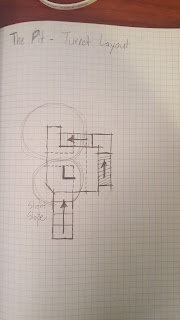
    • Turret
      • Serves as very simple, but effective small, vertical architectural points
      • Basic elements
        • Protected stairs to go up/down on far edge of map
        • More vulnerable elevation change on bridge to top of turret
        • Very open lower room with 3 entrance points
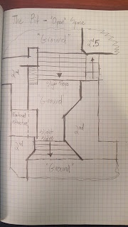
      • Open Space – Sides
        • These open spaces could be something we look at for our large, flatter transition areas
        • Again, floor of a factory-type building, so mostly flat, with organized, wide ramps
        • Tall, enclosed floor variation structures on sides make it possible to traverse this area without constantly being sighted
          • Still relatively open and easier to be seen here than most places though
  • Complex
    • Another good asymmetrical layout to take inspiration from
    • Has a nice flatter overall layout, with structures to provide the more interesting second floor options
    • This could be a good one to look into for our ground floor layout, then overlap something else over it as our second level

Plan Sketches

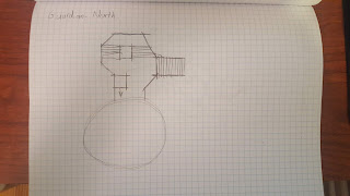
I did a few rough plan sketches of some of the areas I was interested in taking inspiration from for our map design. These just helped to give me a feel for how different parts of a Halo multiplayer map work, and also get a gauge for the scaling of different locations.


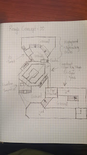
Finally, I attempted a couple sketches that involved trying to piece some of these elements together in a way that might make an interesting Halo multiplayer map.


Tower Defense Tutorial – Brackeys – Ep. 18

February 18, 2019

Tower Defense Tutorial

Episode 18 – Selection

Youtube – How to make a Tower Defense Game (E18 SELECTION) – Unity Tutorial

By: Brackeys
Ep. 18

This tutorial focuses on creating “Selection” functionality, allowing the player to select a turret.

We started by adding World Space UI to an example turret prefab. This will provide us with “sell” and “upgrade” functions later. For now, we just need to set these things up so they will appear when a turret is selected. This involved more use of the Horizontal Layout Group component on UI objects, which consistently do not give me the same result as the tutorial, so I’ll need to look into those.

After setting up the UI, we got into the script for implementing the UI. We started by cleaning up the build manager so that the game doesn’t get cluttered in the situation where it tries to build turrets but also selects a turret on a node. We simply added a “SelectNode” method to the Buildmanager that sets a node variable to the selected node, but also sets turretToBuild to null. Likewise, we added a selectedNode = null; call in the SelectTurretToBuild method. This helps ensure we’re only doing one at a time in game.

We are actually just using this one UI object and moving it around and turning it on/off. Initially we created a new script, NodeUI, and placed that on this node UI system of objects, and gave it a simple method where it would move its position to the target.GetBuildPosition(). This was used instead of target.transform.position because that would give us the center of the node’s location, where as this gives us some other variation of the position that is more applicable (look into).

We also wanted to add some extra functionality, including turning off the UI if the player selects the turret again. This was as simple as checking if the selectedNode was in fact the node clicked on (again). This would then deselect the node, with the Deselect method, which just set selectedNode to null and disabled the nodeUI canvas.

SUMMARY

  • Horizontal Layout Group does not work for me like it does in the tutorials. It may have been changed over Unity versions so I need to look into this.
  • On a Canvas UI object, you can change the values of “Dynamic Pixels per Unit” and “Reference Pixels per Unit” in the Canvas Scalar component to make UI elements show up better depending on the scale you’re working at
  • What does GetBuildPosition() do exactly?

Tower Defense Tutorial – Brackeys – Ep. 17

February 17, 2019

Tower Defense Tutorial

Episode 17 – Game Over

Youtube – How to make a Tower Defense Game (E17 GAME OVER) – Unity Tutorial

By: Brackeys
Ep. 17

This tutorial deals with creating the Game Over screen as a series of UI elements.

We started by adding a gameObject to our OveralyCanvas titled GameOver. This gameobject will hold all of the UI elements dealing with the game over state: new panel, text objects, and buttons for retry and menu.

We changed the OverlayCanvas scaling to “Scale with Screen Size” and used the slider to dictate that it would go by the height of the screen to scale our overlay UI canvas.

For scripting the game over scenario, we decided to expose the gameEnded bool variable to make it easier for everything to know when the game was over. This is useful for basic things such as disabling game inputs on the game over screen. We exposed it by making it a public static bool (and also renaming it to GameIsOver).

Making GameIsOver a public static variable however means it carries over from scene to scene, retaining its value, so we need a way to reset this value. This is easily solved by setting the value of GameIsOver to false in the Start method of our GameManager, as the Start method is called every time a scene begins.

To better organize our objects and scripts, the GameOver game object containing all the game over UI objects also holds the GameOver script. This script will handle everything during the GameOver phase of the game. This works by having the entire GameOver object disabled, and then the GameManager enables it when the GameOver state is reached. At this point, the GameOver object has an OnEnable method in its script, which acts like Start, but occurs when the object is enabled. This begins all the processes needed to be handled during the GameOver phase.

Finally, we wanted to add some animations to our game over screen. We used a basic approach to fading the UI objects in, with some minimal movement and scaling of text/buttons. There was a suggested easy way to fade in UI objects. If you add a “Canvas Group” component to a UI element, it has an alpha value directly tied to it that effects that entire object. This makes it very easy to fade objects in/out by just varying this value from 0 – 1.

SUMMARY

  • Have your GameIsOver as a static bool to make it easier for every script to access this to basically shut down during the game over state
  • Group your Game Over scripting into a single objects that starts OnEnable to keep things organized with minimal references needed
  • Use Canvas Group components on UI elements to easily change entire alpha value (good for fade animations)
  • Offsetting your UI animations can make the screen feel more organic/less robotic

Tower Defense Tutorial – Brackeys – Ep. 16

February 16, 2019

Tower Defense Tutorial

Episode 16 – Slowing

Youtube – How to make a Tower Defense Game (E16 SLOWING) – Unity Tutorial

By: Brackeys
Ep. 16

This tutorial will clean up some of the Turret coding, as well as add a slowing effect to the Laser Beamer turret, as well as damage over time (DoT).

We added this line of code to apply the damage over time to enemies:

targetEnemy.TakeDamage(damageOverTime * Time.deltaTime);

This initially held the GetComponent() call to get the Enemy script component of the target, but this would be very expensive to do every frame. To remedy this, we created the targetEnemy variable which is assigned the GetComponent() value when we select a new target, so it only needs done once each time the laser starts hitting a target.

To clean up our Enemy script coding, we separated it out into two scripts: Enemy and Enemy Movement. Brackeys suggests it is a good practice to keep all of your enemy’s stats or values that you want to change about them in one script, and have the other script components reach out to that information when they need those values (i.e. speed, health, etc.).

To connect our new EnemyMovement script to the original Enemy script, we simply added an Enemy variable, enemy, and then GetComponent() on that at start. To further ensure they are connected (i.e. Future editors know to keep these together), we added a RequireComponent(typeof(Enemy)) above the class name.

We wanted the laser to slow the object a consistent amount. We did not want slows to stack from multiple lasers or increase over time in any way. This resulted in creating a startSpeed to go along with speed. Speed was set equal to startSpeed in the Start method of Enemy. This allows us to constantly set speed as a fraction of startSpeed, since startSpeed is never modified. This also meant we didn’t want to show speed in the inspector, but still needed to keep it public, so we added [HideInInspector] above it so it did not show.

This worked well to slow the enemy, but then it remained slow forever. We needed to reset the speed somehow. Their solution was to just reset the speed every frame in the Update that was moving the enemy (after the movement occurred). While this works, this seems like a lot of extra calculations that could be solved in a cleaner way.

Suggested cleaner solution to slow and movement being off by a frame: Have a list of debuffs that the enemy script goes through each frame to check what debuffs are currently on it, and then apply those to any actions it does.

In this case, we actually went into the Script Execution Order (Project Settings -> Script Execution Order). This allows you to drag in scripts to dictate what order they are processed in. The number value entered is the number of milliseconds between this script and the default time.

SUMMARY

  • Simplest way to do damage over time is to have a method dealing damage * time.deltaTime that is called in Update somehow
  • RequireComponent makes sure that any time you add this script to an object, it will also add the specified component as well. Good for making sure all the components needed for a certain script to reference are on a given object.
  • It is good practice to keep all of an object’s “stats” in one place, and have other functionality that references these stats separated out into other components/scripts. (i.e. Our enemy stats were kept in Enemy, but another script, EnemyMovement, was created which referenced Enemy for stats like speed and then applied that to all the functionality internally)
  • Use [HideInInspector] if you want a public variable but don’t want it shown in the inspector
  • You can use the Script Execution Order to dictate what order scripts are run