Architecture AI Pathing Project: Fixing Highlight Selection Bugs

March 22, 2021

Highlight Selection

Architecture AI Project


Overview

I was having a bug come up with our selection highlight effect where sometimes when moving around quickly, several objects could be highlighted at the same time. This is not intended, as there should ever only be a single object highlighted at once, and it should be the object the user is currently hovering over with the mouse.

Bugfix

Assessing Bug Case

Since it happened generally with moving around quickly in most cases, it was difficult to nail down the direct cause at first. After testing a while though, it was noticeable that the bug seemed to occur more often when running over an object that was non-selectable, onto a selectable object. Further testing showed this was the case when directly moving from a non-selectable to a selectable object right afterward. This helped isolate where the problem may be.

Solution

It turns out in my highlight selection SelectionManager class, I was only unhighlighting an object if the ray did not hit anything or it did both: 1) hit an object and 2) that object had a Selectable component. I was however not unhighlighting an object if the ray: 1) hit an object and 2) that object did NOT have a Selectable component. This logic matched up with the bug cases I was seeing, so this was the area I focused on fixing.

It turns out that was where the error was coming in. By adding an additional catch for this case to also unhighlight an object when moving directly from a selectable object to a non-selectable and back to a selectable object again, the bug was fixed.

Architecture AI Project: Fixing Selection Highlight Bug from Steve Lilley on Vimeo.

Summary

This was a case of just making sure you are properly exiting states of your system given all cases where you want to exit. This could probably use a very small and simple state machine setup, but it seemed like overkill for this part of the project. It may be worth moving towards that type of solution if it gets any more complex however.

via Blogger http://stevelilleyschool.blogspot.com/2021/03/architecture-ai-pathing-project-fixing_22.html

Architecture AI Pathing Project: Cleaning Build UI

March 15, 2021

Working with UI

Architecture AI Project


Working with UI

Since UI looked organized into 4 major groups vertically, I used a Vertical Layout Group for the overall control. I then filled this with 4 empty UI objects, one for each major UI group.

Vertical Layout Group

  • Anchor Preset: stretch/left (anchors to the left, but expands for full vertical screen space)
  • Pivot: (0, 0.5) (Moves pivot point to the far left, so width controls how much it expands out from edge, and Pos X can just remain 0)
  • Child Force Expand: Width (Helps expand everything to fit the full width)
  • Child Force Expand: Height (May not be needed)
  • Control Child Size: Width (May not be needed)
  • Padding: Left, Top, Bottom (Keep everything slightly away from edge)

Controlling the anchors and pivot is extremely important. After setting up the vertical layout group, a lot of the individual control is necessary for the horizontal organization. The anchors, the x position in particular, can be used to help stretch the UI objects to fit whatever is dictated by the overall layout group container.

Using Anchors

For example, many objects are side by side and want to fit half of the given width. To do this, the left object uses anchor X values of min = 0.0 and max = 0.5. The right object uses X values of min = 0.5 and max = 1.0. The values are percentage based, so this allocates the first half of the given space to the first object and the second half to the other.

Using Pivots

The pivot then ties in as this is the base point, or handle of the UI object, so this is the point that all the positioning is relative to. So many of the objects start with a pivot at (0.5, 0.5), which is in the center of the object. This requires annoying extra positioning values, normally half of the width of the object, to fit properly. By moving the pivots though, they become much easier to position.

Again, looking at the UI examples that have 2 objects split the space horizontally, the pivots are used somewhat similarly to the anchors. The left object has its pivot set to (0, 0.5), so the X is set to 0.0. The right object has its pivot set to (1.0, 0.5), so the X is set to 1.0. These are again percentage based, so the (0, 0.5) pivot moves the handle to the extreme left of the object, and the (1.0, 0.5) moves the pivot to the extreme right. This way, the “X position” (now named Left and Right) can just be set to 0. This is conjunction with the edited anchor points will position the object perfectly to fill half the space horizontally.

These uses of UI anchor and pivots can be seen in the following figure in the bottom two groups of UI elements as I worked through applying them (the section with the “Run Sim” button and the section with the “Output .csv” button). The upper sections had not been modified yet.


Fig. 1: Example of These UI Modifications in During Work in Progress (Only Lower 2 Sections)

Summary

I learned a lot about the workings of UI elements in Unity by getting this setup much more organized. The anchors help locate the extents of the positions of a UI element, where as the pivot is simply the base point all the positioning and scaling originates. I also found that changing the anchor presets just has a set value for this different options (which completely makes sense once you look at it). For instance, stretch just sets the anchors to 0.0 and 1.0 to force it to fit the area it is parented by (or the entire screen).

via Blogger http://stevelilleyschool.blogspot.com/2021/03/architecture-ai-pathing-project.html

Architecture AI Pathing Project: Rename Dropdown Elements

February 16, 2021

Dropdown and Input Field UI

Architecture AI Project


Renaming Items in Spawn/Target Dropdown Lists

To get the spawn/target object lists into the dropdowns quickly and accurately, I had them simply add their gameobject names to the dropdowns for the individual item names. These objects however tend to have very long names as they are constructed from several elements coming from the Revit system to accurately identify them. While useful, they are too wordy for identification purposes here and can actually make them harder to find and keep track of. Because of this, we wanted to investigate a way to rename the elements in the list to make them easier to identify in the future.

To accomplish this I looked to add a UI Input Field where any name could be entered and this could be used to rename current items in the dropdown lists. Since there are two dropdowns (Spawn list and Target list), I added two different buttons to account for these. One button applies the current Input Field string as the name of the currently selected Spawn dropdown item, the other button applies it to the Target dropdown item.

The following images help show the name changer in action. The crucical elements are located in the top/central left.

Fig. 1: Initial Setup with Newly Included Input Field and Name Changing Buttons


Fig. 2: Effect of Adding Text to Input Field and Selecting the ‘Rename Spawn’ Button

Clean Up and Error Reduction

Restricting Controls when Accessing Input Field

I added some camera controls to help get around the environment, which included some keyboard shortcuts. These shortcuts however would activate while typing within the Input Field initially. I wanted to disable the camera controller while in the Input Field, so I found Unity has an easy way to determine if a UI element is currently focused, which can be used as a bool to dictate controls. This check can be done with the following:


EventSystem.current.currentSelectedGameObject


So I added a check that if this is null, allow the camera controller inputs, otherwise, disable them.

Null Input Field Check and Instant Dropdown Item Refresh

To keep the dropdown from getting too confusing and adding weird blank items, I added a check to make sure the Input Field is not null or empty before allowing the buttons to edit the current dropdown names. I also found initially that the dropdown item name would change in the dropdown, but it would not be reflected in the current dropdown selections. This looke awkward as I am always updating the current selection, so it would not actually be reflected until you selected the item from the dropdown again. To fix this, Unity’s dropdowns have their own method called RefreshShownValue(), which perfectly resolved this situation.

via Blogger http://stevelilleyschool.blogspot.com/2021/02/architecture-ai-pathing-project-rename.html

Unity UI Design – Video on Color Palettes, Layout Components, and Blur Panel

January 13, 2021

Unity

UI Design


Title:
Making UI That Looks Good In Unity using Color Palettes, Layout Components and a Blur Panel

By:
Game Dev Guide


Youtube – Tutorial & Information

Description:
Making better looking UI, specifically through Unity.


Overview

As I close in on another end point for the Architecture AI project I am working on, I am tweaking the UI elements again. This motivated me to look a bit more into UI design again, and this video looks like a nice quick pickup to provide some significant improvements to my usual UI options. This will also cover making it look a bit nicer, which is a good compliment since I have generally focused on just getting UI elements to work well previously.

via Blogger http://stevelilleyschool.blogspot.com/2021/01/unity-ui-design-video-on-color-palettes.html

Architecture AI Prototype Historical Path Visualization and UI Updates

July 1, 2020

Architecture AI Project

Added Path Visualization and UI Updates

Introduction

To top off the prototype, we added a quick visualization tool to show any paths that agents have taken within the current game session. This was necessary to make it easier to compare the paths of various combinations of agents and environments even. Along with this, some elements of modifying the system that were only accessible within the Unity Inspector have been moved to the in game UI. This makes it much more manageable to alter the agents and their pathing for Unity users and non-users alike.

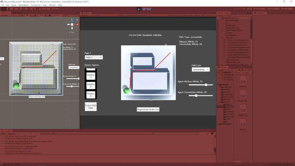
The following quick reference image shows an example of this new path visualization tool (the red line going through the diagonal of the area).

Reference for New Path Visualization Tool (the Red Line is the Path)

Vimeo – My Demo of the Past Path Visualization Tool (with New UI Elements)

Past Path Visualization Feature

Visualization

The path data was already being recorded in an in-depth manner for storing the data in a text format for export, so here we just focused on using that data during the game session to provide another useful data visualization tool. This data is kept as an array of Node objects, which in turn individually hold information on their world position. This provided a solid foundation to visualize the information again.

The array of Nodes could then provide me with an array of world positions which I could use with Unity’s line renderer to create a basic line connecting all of these points. Using the line renderer component also leaves the tool flexible through the Inspector to modify how the line is drawn to fit different needs or environments.

Dropdown UI

To make this easy to access for the user, I added a Unity dropdown UI element to the scene to hold information about all the past paths. It initializes by creating a newly cleared dropdown and adding a simple “None” option which helps keep everything in line, as well as providing the user an obvious spot to go back to when they don’t want to show any previous paths. Then as paths are generated, more options are added to this dropdown to keep it in line with all the paths created (this also keeps their indices in sync for easy reference between the dropdown and the recorded paths).

Added UI Elements for Operating System

As a prototype tool, a quick way to allow for tweaking values and controlling assets is to just use public variables or Unity tool assets (like Unity Ranges and enums within the scripts). This became even cumbersome for myself, so it could be a large issue and slow down for less savvy Unity users. This made me want to explore moving some of these parameters into the game UI for easier use.

Agent Affinity Sliders

I looked into creating Unity UI sliders and since there were pretty easy to implement I moved the range sliders from the Unity Inspector for setting the different agent affinities for the next spawned agent to the game UI. This was straightforward in that the slider values could almost directly be transferred to the spawnmanager (The slider actually goes between values of 0.0 – 1.0 and is multiplied by the max affinity value of the system to properly stay constrained within that range).

Agent Pathing Type Dropdown

After exploring the dropdowns for the path history visualization tool, I also decided to use them for determining the path type of the next spawned agent. This allows the user to quickly choose between different architectural types to use to calculate the agent’s pathing.

Since the architectural types are within a public enum, the dropdown could be populated by the ToString() versions of this entire enum (which can be cycled through in C#). Since they are populated this way in order based on the enum itself, the dropdown can inform the PathFindingHeapSimple (the class that needs to know the type in order to determine which pathing calculations to use) based on the enum index number. They should be kept in sync based on the way the dropdown is created.

Summary

The past path visualization tool is very useful for comparing paths a bit more quickly (since changing values for individual paths can take a small bit of time). It may help in the future of the project to visualize multiple paths at once to directly compare paths very easily. The system also displays information about the path it is showing so the user knows better why the path is the way it is.

Unity’s UI elements are pretty easy to work with, and adding methods to their OnValueChanged delegate is a very nice and consistent way of only calling changes/methods specifically when a UI element is modified. This was perfect for both the dropdowns and the sliders since they only need to invoke change within the system when their values are changed. This keeps them a bit cleaner and more efficient.

The UI elements are strongly tied to the borders of the screen using the standard Unity positioning constraint system, so it can look really messy at smaller resolutions. It operates well enough since there’s not too much going on, so just allocating a decent resolution to the window when using it at least shows everything which is the most important aspect for a prototype.

Building Unity UI that scales for a real game – Prefabs/Scenes? by Jason Weimann

January 24, 2020

Unity UI

Scaling and Scenes

Building Unity UI that scales for a real game – Prefabs/Scenes?

Youtube – Link

By: Jason Weimann


Notes

UI is a big part of a lot of games, so it is something that is always good to learn more about. This also deals with using UI that works across multiple scenes, so this could possibly be another route to take when dealing with the new scene management techniques I have looked into.

Tower Defense Project – Fixing UI Text

September 2, 2019

Tower Defense Tutorial Project

UI Text

GOAL:

Fix game over UI text and look into round text references to see why they update strangely.

NOTES:

For the GameOver screen producing weird text results, my first thought was to the check the inspector references. I know tying the stats into text UI elements uses inspector references, so making sure those were correct was the first check. Sure enough, it looked like the wrong text was dragged into the GameOver UI inspector field. I must have grabbed the wrong one initially, as the generic text was dragged in there as opposed to the text that should be holding the round number.

As for the issue with the round text timing being off, I figured that had to do with the way the coroutine to animate the text was setup. It should count up from 0 to the final round number the player ended on (whether they won or lost), but it was starting on that final round number, THEN going to 0 and counting back up again. This just looks really bad, so it needed fixed. From checking the RoundsSurvived script (which is the same for both the Rounds object in GameOver and LevelCompleted), it looked like the animation coroutine was being set to start, and the next line was setting the roundsText to the playerStats.rounds. This is most likely the issue, as the coroutine starts, the text is immediately set to the rounds value as dictated by the very next line, then the coroutine continues running updating the value until it hits the rounds value again. This fits inline with the incorrect behavior we are getting.

PROBLEM 1

The incorrect text being displayed on the GameOver UI.

TEST 1

Move the Rounds (Text) into the RoundsSurvived inspector field as opposed to the Text (text) for the GameOver screen.

SOLUTION: This was all it was, updating this fixed the issue and the text was all in the proper place on the GameOver UI.

PROBLEM 2

Round counting animation starts at the max value, then immediately goes to 0, THEN counts up to max value again.

TEST 1

I removed the line right after the one initializing the AnimateText coroutine that was setting the rounds text to the rounds value.

SOLUTION: This appeared to solve the issue with some testing. Both the GameOver and CompletedLevel UI would start the round counter at 0, then count up to the correct number of rounds survived.

NEXT STEP:

Make 5 uniquely distinct levels to test the overall system. This includes testing generic gameplay as well as the general level progression and level selection system. As I am using a basic built in Unity way to handle saving progression right now, I have had all the levels unlocked for recent testing. I need to reset that and test that that is tracked properly, especially over several levels to make sure the system holds that many as well as giving more data points for any possible issues.

Pokemon Unity Tutorial – BattleManager [Pt.8]

August 23, 2019

Unity Pokemon Tutorial

BattleManager

Youtube – Lets Make… Pokemon in Unity! – Episode 8 BattleManager Code

By: BrainStorm Games

This tutorial focuses on the scripting the actual functionality of all the UI in the battle scenes. This includes giving all of the different text selections their various functionalities when the player selects them during a battle.

The intial setup for the BattleManager script was a huge pain in this tutorial. It started with creating a bunch of public GameObjects and Text objects to provide input fields in the inspector. There were almost 20 different elements created at once here. Then, we had to plug in all of the corresponding UI Text and Panel objects from the last tutorial into these fields. Many of these objects were never renamed at all (or named poorly as the script name does not match the object name in any manner). This will be workable since this is not the main reason I am doing these tutorials.

After setting all of these, they set up a switch case which uses a newly created BattleMenu enum to determine which of these UI elements should be set active/inactive at any given time. This is all done in a ChangeMenu method that takes in a BattleMenu paratmeter. This method is called in the GameManager.

Then they setup a monster nested switch case in the Update method to give the illusion of the “cursor” moving around the different menu options. Every button press goes into this huge switch case that first determines which menu you are in, and then depending on that menu, determines which text elements it needs to change (since it only wants to change those on the currently visible menu). It then resets every text element to its initial string, while changing the current string by just adding “> ” in front to look like a cursor is selecting it. The code for the menu selection is as follows:

private void Update()
{
if (Input.GetKeyDown(KeyCode.DownArrow))
{
Debug.Log(“Down pressed and currentSelection is: ” + currentSelection);
if(currentSelection < 4)
{
currentSelection++;
}
}
if (Input.GetKeyDown(KeyCode.UpArrow))
{
Debug.Log(“Up pressed and currentSelection is: ” + currentSelection);
if (currentSelection > 0)
{
currentSelection–;
}
}
if(currentSelection == 0)
{
currentSelection = 1;
}

switch (currentMenu)
{
case BattleMenu.Fight:
switch (currentSelection)
{
case 1:
moveO.text = “> ” + moveOT;
moveT.text = moveTT;
moveTH.text = moveTHT;
moveF.text = moveFT;
break;
case 2:
moveO.text = moveOT;
moveT.text = “> ” + moveTT;
moveTH.text = moveTHT;
moveF.text = moveFT;
break;
case 3:
moveO.text = moveOT;
moveT.text = moveTT;
moveTH.text = “> ” + moveTHT;
moveF.text = moveFT;
break;
case 4:
moveO.text = moveOT;
moveT.text = moveTT;
moveTH.text = moveTHT;
moveF.text = “> ” + moveFT;
break;
}

break;

case BattleMenu.Selection:
switch (currentSelection)
{
case 1:
fight.text = “> ” + fightT;
pokemon.text = pokemonT;
bag.text = bagT;
run.text = runT;
break;
case 2:
fight.text = fightT;
pokemon.text = “> ” + pokemonT;
bag.text = bagT;
run.text = runT;
break;
case 3:
fight.text = fightT;
pokemon.text = pokemonT;
bag.text = “> ” + bagT;
run.text = runT;
break;
case 4:
fight.text = fightT;
pokemon.text = pokemonT;
bag.text = bagT;
run.text = “> ” + runT;
break;
}

break;
}


}

There has to be a much better way to do a menu system like this. I’d imagine you would just want everything to be set into an array of some kind where the inputs just move through the array elements. Then you would just tie some visual representation to whatever UI element is currently selected. This just seems very frail, hard to read, and hard to edit.

Pokemon Unity Tutorial – Battle GUI [Pt.7]

August 21, 2019

Unity Pokemon Tutorial

Battle GUI

Youtube – Lets Make… Pokemon in Unity! – Episode 7 Battling GUI

By: BrainStorm Games

This tutorial focuses on setting up the GUI within a battle encounter. This includes creating the panels necessary for holding all of the information about the battle and the player’s input options.

The UI panel holding the moves was given a Grid Layout Group component. This helps when you want to layout children UI elements in a grid pattern. This component holds information such as padding (spacing added around borders of current UI elements) and cell size (how much space to give each individual grid component).

Working with UI elements in Unity is always weird and unpredictable for me, and this time was no different. When making the health bar UI canvases, I created the background (health container) and foreground (current health) health elements for the player’s pokemon first without any issue. However, when I duplicated both and tried to move them into position for the opposing pokemon, they acted very strangely. I was resizing them with their values in the insepctor and all of a sudden the foreground bar became extremely thin, like a line. Something must have “broke” when duplicating these scaling canvas UI elements and moving them as children into a different UI element that caused them to act strangely after editing them to any degree. I ended up solving this by deleting out the background element, fixing up the foreground element and just duplicating that and changing the color for the new background element for the opposing pokemon.

Unity can do UI layering in the hierarchy. The element that is lower will be shown above the other elements, which is how the foreground UI element for health was shown above the background container. This works good enough for the tutorial, but I would like to look into having more proper control for UI layering.