Architecture AI Pathing Project: Fixing Highlight Selection Bugs

March 22, 2021

Highlight Selection

Architecture AI Project


Overview

I was having a bug come up with our selection highlight effect where sometimes when moving around quickly, several objects could be highlighted at the same time. This is not intended, as there should ever only be a single object highlighted at once, and it should be the object the user is currently hovering over with the mouse.

Bugfix

Assessing Bug Case

Since it happened generally with moving around quickly in most cases, it was difficult to nail down the direct cause at first. After testing a while though, it was noticeable that the bug seemed to occur more often when running over an object that was non-selectable, onto a selectable object. Further testing showed this was the case when directly moving from a non-selectable to a selectable object right afterward. This helped isolate where the problem may be.

Solution

It turns out in my highlight selection SelectionManager class, I was only unhighlighting an object if the ray did not hit anything or it did both: 1) hit an object and 2) that object had a Selectable component. I was however not unhighlighting an object if the ray: 1) hit an object and 2) that object did NOT have a Selectable component. This logic matched up with the bug cases I was seeing, so this was the area I focused on fixing.

It turns out that was where the error was coming in. By adding an additional catch for this case to also unhighlight an object when moving directly from a selectable object to a non-selectable and back to a selectable object again, the bug was fixed.

Architecture AI Project: Fixing Selection Highlight Bug from Steve Lilley on Vimeo.

Summary

This was a case of just making sure you are properly exiting states of your system given all cases where you want to exit. This could probably use a very small and simple state machine setup, but it seemed like overkill for this part of the project. It may be worth moving towards that type of solution if it gets any more complex however.

via Blogger http://stevelilleyschool.blogspot.com/2021/03/architecture-ai-pathing-project-fixing_22.html

Architecture AI Pathing Project: Cleaning Build UI

March 15, 2021

Working with UI

Architecture AI Project


Working with UI

Since UI looked organized into 4 major groups vertically, I used a Vertical Layout Group for the overall control. I then filled this with 4 empty UI objects, one for each major UI group.

Vertical Layout Group

  • Anchor Preset: stretch/left (anchors to the left, but expands for full vertical screen space)
  • Pivot: (0, 0.5) (Moves pivot point to the far left, so width controls how much it expands out from edge, and Pos X can just remain 0)
  • Child Force Expand: Width (Helps expand everything to fit the full width)
  • Child Force Expand: Height (May not be needed)
  • Control Child Size: Width (May not be needed)
  • Padding: Left, Top, Bottom (Keep everything slightly away from edge)

Controlling the anchors and pivot is extremely important. After setting up the vertical layout group, a lot of the individual control is necessary for the horizontal organization. The anchors, the x position in particular, can be used to help stretch the UI objects to fit whatever is dictated by the overall layout group container.

Using Anchors

For example, many objects are side by side and want to fit half of the given width. To do this, the left object uses anchor X values of min = 0.0 and max = 0.5. The right object uses X values of min = 0.5 and max = 1.0. The values are percentage based, so this allocates the first half of the given space to the first object and the second half to the other.

Using Pivots

The pivot then ties in as this is the base point, or handle of the UI object, so this is the point that all the positioning is relative to. So many of the objects start with a pivot at (0.5, 0.5), which is in the center of the object. This requires annoying extra positioning values, normally half of the width of the object, to fit properly. By moving the pivots though, they become much easier to position.

Again, looking at the UI examples that have 2 objects split the space horizontally, the pivots are used somewhat similarly to the anchors. The left object has its pivot set to (0, 0.5), so the X is set to 0.0. The right object has its pivot set to (1.0, 0.5), so the X is set to 1.0. These are again percentage based, so the (0, 0.5) pivot moves the handle to the extreme left of the object, and the (1.0, 0.5) moves the pivot to the extreme right. This way, the “X position” (now named Left and Right) can just be set to 0. This is conjunction with the edited anchor points will position the object perfectly to fill half the space horizontally.

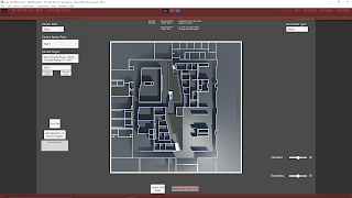
These uses of UI anchor and pivots can be seen in the following figure in the bottom two groups of UI elements as I worked through applying them (the section with the “Run Sim” button and the section with the “Output .csv” button). The upper sections had not been modified yet.


Fig. 1: Example of These UI Modifications in During Work in Progress (Only Lower 2 Sections)

Summary

I learned a lot about the workings of UI elements in Unity by getting this setup much more organized. The anchors help locate the extents of the positions of a UI element, where as the pivot is simply the base point all the positioning and scaling originates. I also found that changing the anchor presets just has a set value for this different options (which completely makes sense once you look at it). For instance, stretch just sets the anchors to 0.0 and 1.0 to force it to fit the area it is parented by (or the entire screen).

via Blogger http://stevelilleyschool.blogspot.com/2021/03/architecture-ai-pathing-project.html

Architecture AI Pathing Project: Rename Dropdown Elements

February 16, 2021

Dropdown and Input Field UI

Architecture AI Project


Renaming Items in Spawn/Target Dropdown Lists

To get the spawn/target object lists into the dropdowns quickly and accurately, I had them simply add their gameobject names to the dropdowns for the individual item names. These objects however tend to have very long names as they are constructed from several elements coming from the Revit system to accurately identify them. While useful, they are too wordy for identification purposes here and can actually make them harder to find and keep track of. Because of this, we wanted to investigate a way to rename the elements in the list to make them easier to identify in the future.

To accomplish this I looked to add a UI Input Field where any name could be entered and this could be used to rename current items in the dropdown lists. Since there are two dropdowns (Spawn list and Target list), I added two different buttons to account for these. One button applies the current Input Field string as the name of the currently selected Spawn dropdown item, the other button applies it to the Target dropdown item.

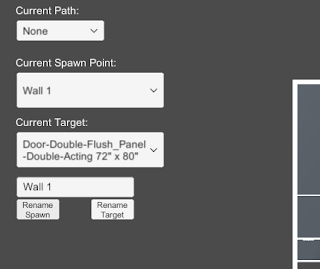
The following images help show the name changer in action. The crucical elements are located in the top/central left.

Fig. 1: Initial Setup with Newly Included Input Field and Name Changing Buttons


Fig. 2: Effect of Adding Text to Input Field and Selecting the ‘Rename Spawn’ Button

Clean Up and Error Reduction

Restricting Controls when Accessing Input Field

I added some camera controls to help get around the environment, which included some keyboard shortcuts. These shortcuts however would activate while typing within the Input Field initially. I wanted to disable the camera controller while in the Input Field, so I found Unity has an easy way to determine if a UI element is currently focused, which can be used as a bool to dictate controls. This check can be done with the following:


EventSystem.current.currentSelectedGameObject


So I added a check that if this is null, allow the camera controller inputs, otherwise, disable them.

Null Input Field Check and Instant Dropdown Item Refresh

To keep the dropdown from getting too confusing and adding weird blank items, I added a check to make sure the Input Field is not null or empty before allowing the buttons to edit the current dropdown names. I also found initially that the dropdown item name would change in the dropdown, but it would not be reflected in the current dropdown selections. This looke awkward as I am always updating the current selection, so it would not actually be reflected until you selected the item from the dropdown again. To fix this, Unity’s dropdowns have their own method called RefreshShownValue(), which perfectly resolved this situation.

via Blogger http://stevelilleyschool.blogspot.com/2021/02/architecture-ai-pathing-project-rename.html

Unity UI Design – Video on Color Palettes, Layout Components, and Blur Panel

January 13, 2021

Unity

UI Design


Title:
Making UI That Looks Good In Unity using Color Palettes, Layout Components and a Blur Panel

By:
Game Dev Guide


Youtube – Tutorial & Information

Description:
Making better looking UI, specifically through Unity.


Overview

As I close in on another end point for the Architecture AI project I am working on, I am tweaking the UI elements again. This motivated me to look a bit more into UI design again, and this video looks like a nice quick pickup to provide some significant improvements to my usual UI options. This will also cover making it look a bit nicer, which is a good compliment since I have generally focused on just getting UI elements to work well previously.

via Blogger http://stevelilleyschool.blogspot.com/2021/01/unity-ui-design-video-on-color-palettes.html