Unity – Exploring the Physics – Rigidbody and Drag

March 10, 2021

Rigid Body Physics

Unity


Title: How is Drag Calculated by Unity Engine?


Unity Forum – Link


Description:
Explanation of someone’s testing of Unity’s rigid body drag value.


Overview

I was just exploring Unity’s physics through Rigidbodys and Physics Materials to see what different feels and effects I could get with them, and decided to delve a bit further into them.

Rigid Body

I was just doing very general testing without much research this time around just to see what I got from using the different values. Mass acts pretty much how you would expect, as it requires more force to accelerate the object and stops it faster when friction is involved.

Drag

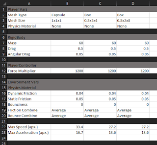
Drag and Angular Drag however were a bit trickier. While Drag did reduce the acceleration of the object as it moved, and eventually the velocity as force stopped being applied, it did not appear to matter what direction or shape the object’s facing direction created. I tested it with a narrow box, and moving straight on the narrow side and moving completely perpendicular with the long face of the box resulted in the same max speed values.

While I assumed this meant the shape did not matter whatsoever, I tested a capsule and a box with the exact same settings in the Rigidbody component on the exact same surface with the same physics material, and the box gave a lower terminal velocity than the capsule. I could not find any reason for this, other than possibly different collider types may have different effects on how drag or friction impacts them.

The link I attached above is a bit old now, but it comes from someone that belives they found an accurate approximation of Unity’s drag. At the very least, several sources I came across indicated that drag is linearly related to velocity in Unity’s Phys X engine, which is different from true drag which related to the square of the velocity of an object. I would have to do more testing to see if this person’s formula is accurate now (since this is about 5/6 years old now), and will have to do some more research to see if I can find any more up to date takes on Unity’s drag.

Physics Materials

I have not delved into these far yet, but the basics seem to make sense. I have only been exploring the friction values, and they seem to act as expected. The dynamic friction slows down objects rubbing against a surface as they move, and the static friction presents a force that needs to be overcome before the objects starts to move. Bounciness and the combining of the factors are aspects I have not yet tested at all currently.


Fig. 1: Quick Snap Shot of My Unity Physics Testing Table

Summary

With my quick initial tests, some interesting results have already come up. As noted previously, the primitives seem to be effected by physics differently somewhere in the pipeline. I suspect it is the drag factor, but it could also be friction, or some other inherent factor. Another interesting note is that both boxes had the exact same max speeds, even though one made much more contact with the ground. I would like to perform some more testing to see if the friction values at least make it accelerate slower overall, and reach max speed slower.

via Blogger http://stevelilleyschool.blogspot.com/2021/03/unity-exploring-physics-rigidbody-and.html

Youtube Audio Library for Free Background Music for Videos

March 04, 2021

Free Music Source

Music


Title: Youtube Audio Library


Youtube – Audio library


Buffer – 13 Fantastic Places to Find Background Music for Your Video Content


Description:
Source of free music by youtube to use as background music for videos.


Overview

It was suggested to me that adding any kind of sound or music to videos that otherwise have no audio is a good addition just so users do not think they may be missing any audio. I wanted to find a consistent source of free music to add to the background of videos and came across this library supplied by Youtube. It is my understanding that this music is fully public domain and creative commons.

I also found a link for several music sources through Buffer. That has been provided, and that is where I discovered Youtube’s audio library. This could be a good source to find other sources if I misunderstood any of the legality of the Youtube audio library.

via Blogger http://stevelilleyschool.blogspot.com/2021/03/youtube-audio-library-for-free.html

Drawing and Rendering Many Cube Meshes in Unity (Part 1 of Part 1)

March 03, 2021

Shaders for Game Devs

Shaders


Title:
Shader Basics, Blending & Textures • Shaders for Game Devs [Part 1]


By: Freya Holmér


Unity – Forum

Description:
Discussions and code for drawing and rendering many cube meshes.


Overview

I have been exploring shaders as an option for efficiently generating large amounts of geometry and came across this recent talk covering shaders all the way from the beginning. This seems like a good opportunity to at least get a better understanding of what they are and good cases to look into using them.

Intro to Shaders

Shaders: code that runs on the GPU in their truest form
This was there answer for the simplest form of explaining what a shader is from a game development point of view, and I liked it as a good starting foundation to help my understanding. Textures, Normal Maps, Bump Maps, etc. are all examples of tools that can be used as input for shaders. Shaders then use the information provided by those along with their given code to determine how to visualize and render with that information.

Fresnel Shader: as something fades away from you, you get a stronger light.
It looks like an outline type effect often, but it is not an outline effect. It will highlight features which are moving away from your view. As the angle towards some surface versus the camera is very low, something happens. This is just a commonly used type of shader.

Structures of a Shader

Structure within Unity (Description)[Language or Tool to Modify]:

Shader

– Properties (Input data) [ShaderLab]

– Colors

– Values

– Textures

– Mesh

– Matrix4x4 (transform data: where it is, how it’s rotated, how it’s scaled)

– SubShader (can have multiple in a single shader) [ShaderLab]

– Pass (Render/Draw pass; Can have multiple)

– Vertex Shader [HLSL]

– Fragment Shader (“Pixel” Shader) [HLSL]

Vertex Shader

This deals with all the vertices of the mesh. Similar to a foreach loop that runs over all the vertices you have. One of the first common issues with vertex shaders is placing the vertices. Shaders however do not particularly care about world space. They generally deal with position in clip space, which are values between 0 and 1 to determine where to place them on the screen. This can often be done simply by taking the local space coordinates and transform them with an MVP matrix to convert them to clip space and you are done.

Vertex shader is often used to animate water or sway grass and foliage in the wind. This aspect is used often to provide movements or animation. They mention that vertex UV coordinates can be manipulated in the vertex shader or the fragment shader, but if possible to do in the vertex shader it should be done their first. All you do here is set the positions of vertices or pass data to the fragment shader.

Fragment Shader

This is similar to a foreach loop that runs over each fragment. A pixel usually refers directly to a pixel being rendered on the screen, which a fragment shader does not always deal with. However, it is common for these to overlap, which is why some call this a pixel shader. This aspect generally comes down to determining what color to set for every fragment or pixel. The vertex shader always runs before the fragment shader. Data can be passed from the vertex shader to the fragment shader, but not vice a versa.

Shaders vs. Materials

Mesh and Matrix4x4 are normally supplied by your mesh renderer component or something like that, where as colors, values, and textures are something you must define yourself. These properties are generally defined with materials. The material helps contain these parameters which are then passed in to the shaders. You never “add a shader to an object” in Unity, it is effectively done by adding a material which then references the shader to be used. You can think of materials as preconfigured parameters to be used when rendering something with a shader. You can have multiple materials which all use the same shader, but have different input properties.

via Blogger http://stevelilleyschool.blogspot.com/2021/03/drawing-and-rendering-many-cube-meshes_3.html

Drawing and Rendering Many Cube Meshes in Unity

March 02, 2021

Drawing and Rendering Meshes

Unity


Title:
Drawing 1 Million cubes!


Unity – Forum

Description:
Discussions and code for drawing and rendering many cube meshes.


Overview

I wanted to be able to replicate the drawcube Gizmos in Unity I am using to portray data for my architecture project in the game scene and eventually builds of the project. To do this I need a very lightweight way to draw many small cube meshes, so I looked into drawing/rendering my own meshes and shaders. This option I came across in a Unity forum to just draw and render meshes on Update seemed decent enough so I investigated a simpler version for my needs.

Implementation

I could get away with a much simpler version of the CubeDrawer script found in the forum comments. I could strip out the batching and the randomization as I need very specific cubes and no where near the million cubes they were rendering. I am normally looking at somewhere in the thousands to ten-thousands, and want very specific locations.

So I stripped this script down and tweaked it some for my needs so I could feed the position and color data I was already creating from my node grids and heatmaps into this simpler CubeDrawer. I then had it build and render the cubes. It was able to give me the visual results I wanted, but I was seeing a significant performance reduction. The AI agents had stuttery movement and the camera control had a bit of lag to it. I’ll need to investigate ways to reduce the performance hit this has, but it’s a step in the right direction.

via Blogger http://stevelilleyschool.blogspot.com/2021/03/drawing-and-rendering-many-cube-meshes.html

BitFontMaker 2 – Make Your Own 8-Bit Style Fonts

February 23, 2021

Font Creation

Game Text


BitFontMaker 2 – Pentacom.jp

Description:
Online tool for building your own bit-style fonts for games.


Overview

This was a neat tool I saw AdamCYounis using to create their own stylized bit-style text for their game project. It appears to be straight forward to use, and allows you to build out all the individual characters for a font using a pixelized grid to design each of them.


Fig. 1 – BitFontMaker2 Site Example with “A” Being Drawn

via Blogger http://stevelilleyschool.blogspot.com/2021/02/bitfontmaker-2-make-your-own-8-bit.html

Designing Pixel Art Color Palettes in Aseprite by AdamCYounis

February 19, 2021

Pixel Art

Color Palettes with Aseprite


Title:
Pixel Art Class – Palettes & Colour

By:
AdamCYounis


Youtube – Tutorial

Description:
Learning about creating your own pixel art color palettes with the help of Aseprite.


Overview

This video covers the creation of color palettes for use in pixel art projects at an introductory level. The user is well versed in Aseprite, so they do so through this software and show some tricks within it to help in the palette creating process. They also go over some general color choosing concepts and their general process for creating palettes to give you a nice starting point.

Reviewing a Palette Against the Spectrum

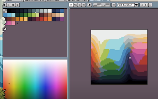
To check how a chosen palette matches up against an entire section of a color spectrum, they copy and paste a full slice of the color spectrum (slice because the color spectrum is 3D ‘i.e. R, G, and B or H, S, and V’ so you can only view a particular 2D slice at any given time) into a new image in Aseprite. Then from here, they select their color palette and check the Indexed Color Mode in Aseprite. This will break down the full spectrum shown into which colors of the palette most closely resemble each and every part of the spectrum.

This is very effective in seeing how a given color palette covers a full spectrum to see which types of colors it can represent in more detail and which will be more generalized. This means it can also help you guide your color selection process while building a palette because you can see areas it is deficient in that you may want to add more options to.

Found through:

Sprite -> Color Mode -> Indexed


Aseprite Indexed Color Spectrum Compared to Palette Example (from video tutorial)

Creating a Color Palette

They start with selecting an initial saturation level.
This helps set the tone for all your colors and it is generally uncommon to see images with stark contrasts in saturation, making this a good starting point. They tend to choose a saturation around the 50 – 60% area since that’s just in the middle.

They then choose a starting color in the greens or blues and mostly just look for a color they think looks nice. Starting with green, they generally look for something that works well for grass since they are looking for practical applications as a game developer most of the time. Once they find a good starting color, they add that to the palette.

Creating Color Ramps

Next they look to build a color ramp with that color. They simply shift the color somewhat in hue and somewhat in lightness or value. For example with the green, they will move up towards a lighter green as well as left towards the yellow in a single shift. If they move down, they move towards the darker green as well as right towards the blue. They choose more colors than they think they will need, so they can see more color options during the building process and they can remove excess colors later.

As they note later, if you are working on a yellow hue, moving towards yellow does not particularly work. They reference using your specific context and feel you are going for to help you determine how you will shift colors. Their example was that they had their yellow shift towards brown as it got darker to help with getting woody and leathery tones. They also had a red that shifted towards yellow as it got lighter (which would be to the ‘right’ as opposed to the ‘left’ the green is using).

You can see the color you select in the palette on your chosen color spectrum. This can be used to see how well your colors line up with your original designated color. If they do not line up well, you can use this to help you determine how to tweak individual colors in the ramp to work better for you.

After this, they start to throw the colors on the canvas to see how they look individually as well as with each other. A helpful shortcut for this is the square bracket keys ([,]) as they let you move between color indices. They identify which colors they like and which ones work well with those and which don’t. They then modify the colors they don’t like or that don’t match well with their ideal colors to fall in line. Afterwards, they then identify any colors in the ramp they do not need or that seem extraneous and remove them to simplify the palette.

They do not tend to try and exactly make precise mathematical jumps from color to color or shade to shade. While it can help as a general starting point, they suggest just going by what your eyes tell you when they think it “looks good”. The example they show was that a larger jump between the brighter colors and much smaller jumps between the darker colors looked pretty nice for their color ramp.

Another option to keep in mind is changing the values of all the colors in a ramp at once. You can select the entire ramp, or portions of the ramp, and alter their hue, saturation, or value/lightness all together. Hue will change the color, so usually only slight variations will work their, but some of the other ones can support significant differences to provide different feels or tones.

Keyboard Shortcuts:

Move Between Color Indices = [ and ]

Bridging Ramps

They tend to think of their overall color palette as converging at the ends of lightness and darkness. So as they get closer to white, the colors all get much more similar, and likewise as they get closer to black. The colors then in effect, widen and spread a larger range closer to the middling values between white and black.

This is not something that needs to be done everytime by any means, this is just one approach they tried. Again looking at the color bridge examples, this approach effectively makes the top and bottom (the whites and blacks) a color bridge spanning across all your various hues.

To help this process, once a ramp is in place, they looked to increase the saturation of the colors in the upper-middle-third of the colors, and desaturate all the other colors. This helps the higher and lower colors “bleed into each other” better.

They then move to their next hue (blue in this case) and begin the process of building another color ramp. They can leave previous colors and ramps on the canvas to help provide context for the current color ramp they are structuring. As they place the new colors on the canvas to test them, they also use Aseprite’s shade tool to quickly check all the different colors through their ramp.

Summary

To recap their process shown in the tutorial:
They start by selecting a saturation level to use across the entire palette (usually in the 50 – 60% range). They start with a main focus color and just try to find a good looking color to represent it to serve as a starting point. They then create a color ramp for this color by moving up and towards yellow to provide warmth as they brighten their colors, and down and towards blue to provide coolness as they darken the colors. Some colors will require moving towards other colors, so choose what fits your overall feel and needs. Creating a linear color ramp (a straight line through the HSV spectrum image) can be a decent starting point, but they do not fear strongly breaking away from this to get the right tones. Also choose extra colors, as later when colors seem too close they are easily removed to simplify the palette.

They then throw the colors from that ramp all over the canvas to see how they look individually as well as with each other. Here they do further tweaking until it looks good. These processes are then repeated with each of the next colors, and they can continually be added to the canvas to see how they work in the context of your other selected colors as well.

To create one type of bridging, they look to bridge everything at the brightest and darkest levels. To achieve this they increase the saturation on the upper-part of the middle third of all their color ramps, and desaturate everything else. This widens the color range of those middling colors, while brinding all the more extreme colors closer together so they can blend together easily.

Finally, the entire color palette can be cross examined with the HSV spectrum to see how your colors cover the full spectrum. This is done in Aseprite by taking a quick snapshot of the HSV spectrum, opening it as an image, and using the “Indexed” color mode with the palette selected. From here further tweaks can be made if you feel a color is under/over represented in the amount of detail and differentiation it provides.

via Blogger http://stevelilleyschool.blogspot.com/2021/02/designing-pixel-art-color-palettes-in.html

Aseprite Crash Course by AdamCYounis

February 18, 2021

Pixel Art

Aseprite Introduction


Title:
An Aseprite Crash Course In 30 Minutes

By:
AdamCYounis


Youtube – Tutorial

Description:
Intro to using Aesprite and some basic work flow tips.


Overview

This tutorial offered a great overview of the most used tools, as well as how to quickly and efficiently use them. They cover their workflow and how these tools fit into that to get you started using Aseprite effectively.

Timeline

This is where the layers are contained. This also holds the separate frames, which can help which creating and previewing animations.


View Timeline Shortcut: Tab

New Frame Shortcut: Alt + N

Their Workflow

  1. Blocking (Silhouette)
  2. Shading
  3. Coloring
  4. Detailing

Feature Options

  • Pixel-perfect: Off
  • Symmetry: Sometimes
  • Pencil (Brush): Often round
  • Pressure Sensitivity: Off

Shading

Blot several colors

Eyedropper Tool


Alt temporarily gives you the eyedropper tool while holding it. This lets you quickly use it to just grab one of the few colors you have already blotted on the canvas and use it to continue coloring as you start the initial shading phase. This is very strong for a quick early workflow since you tend to only use a couple colors, so this gives you access to those couple colors while switching between them easily very quickly.

Shading Mode

This let’s you select a small palette of colors and whenever you paint over a color included in that set, it will cover it with the next shifted color (either 1 up or 1 down depending on ordering selected). This can be tricky to use, but can help quickly modify some shading areas.

Their keyboard shortcut setup (Not default):

  • B = Pencil (Brush)
  • D (while in Pencil) = Simple Ink
  • S (while in Pencil) = Shading Mode

Zoom

Zoom Tool Shortcut: Z

LClick/RClick (while in Zoom) = zoom in/out

Move mouse horizontally while holding either click = zoom in/out continuously

This focuses on the pixel you have selected, so very useful for focusing in on a specific pixel/area.

Marquee Tool

Marquee Tool Keyboard Shortcut: M


This tool lets you select an area that will allow only that area to be worked on. For example, you can select an area then your brush will only paint that area, even if you go outside of the box while painting.

There is also a lasso option and a wand option. The lasso option lets you draw an area to cover manually, and the wand option selects all similarly colored contiguous pixels (similar to a bucket tool).

Move Tool (Layer Selector)

Move Tool Keyboard Shortcut: V


This lets you move an entire layer. This can also select the layer you click on when the “Auto Select Layer” option is toggled ‘On’. They use this feature a lot as more of a layer selection tool than it’s base movement functionality to quickly swap between layers.

Operations Across a Selection

Aseprite is very good at allowing you to select multiple items at once and applying an operation to all of them at once.

Examples:

  • Select several colors in the palette and increase all of their brightness values an even amount.
  • Select multiple frames and perform a color swap (i.e. change all of one specific color found in all the frames to another specific color)
  • That can be done along with the marquee tool to only change the colors on every frame within the area selected by the marquee tool on every frame.

Other Strong Features (Replace Color and Outline)

Replace Colors: Shift + R

Outline: Shift + O


Outline is extremely strong for creating outlines around an entire body. The outline can be placed on the inside or outside of the body. Their are options for creating a rounded or square outline, as well as only outlining horizontally or vertically. It also includes a tool to fine tune which types of corners to include extra squared off pixels or not.

Export Options

Exporting for General Sharing

Resize during export can be beneficial for sharing your work often as if will often be very small, so it will either show up extremely tiny or very blurry if resized by your sharing option.

You can also choose specific layers or specific frames to export. Exporting multiple frames can allow you to export as a .gif file.

Exporting as Game Asset

DO NOT CHANGE SIZE WHEN EXPORTING FOR GAME ASSETS!!!!

For exporting multiple frames as a sprite sheet:

  • Press Ctrl + E
  • Sheet type: by rows, by columns, etc.
  • Still choose layers and frames

Quick Art Sample I Create Learning Tools

Here is a quick lava creature I was able to create while learning to use some of the tools and workflow exhibited in this tutorial.

Workflow Summary

Common tools:

  • Pencil (Brush)
  • Eraser
  • Eyedropper
  • Zoom
  • Marquee
  • Move

They use pencil and eraser to draw out the initial silhouette. Next, they add a couple shading colors to the canvas so they can quickly move between those colors with the eyedropper tool to apply shading. Shading mode on the brush tool can help with this once you are a bit more advanced.

The zoom tool helps focus in on specific pixels or areas for shading, coloring, and detailing, as it will focus in on the pixel you are hovering. The marquee tool helps with focusing your work on a specific area without affecting the area around it.

The move tool is actually a very strong layer selection tool with the “Auto Select Layer” option. This helps them move between different layers quickly.

via Blogger http://stevelilleyschool.blogspot.com/2021/02/aseprite-crash-course-by-adamcyounis.html

Architecture AI Pathing Project: Rename Dropdown Elements

February 16, 2021

Dropdown and Input Field UI

Architecture AI Project


Renaming Items in Spawn/Target Dropdown Lists

To get the spawn/target object lists into the dropdowns quickly and accurately, I had them simply add their gameobject names to the dropdowns for the individual item names. These objects however tend to have very long names as they are constructed from several elements coming from the Revit system to accurately identify them. While useful, they are too wordy for identification purposes here and can actually make them harder to find and keep track of. Because of this, we wanted to investigate a way to rename the elements in the list to make them easier to identify in the future.

To accomplish this I looked to add a UI Input Field where any name could be entered and this could be used to rename current items in the dropdown lists. Since there are two dropdowns (Spawn list and Target list), I added two different buttons to account for these. One button applies the current Input Field string as the name of the currently selected Spawn dropdown item, the other button applies it to the Target dropdown item.

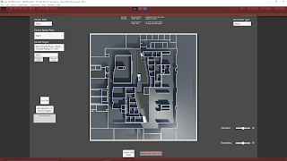
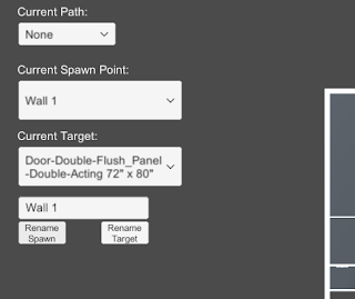
The following images help show the name changer in action. The crucical elements are located in the top/central left.

Fig. 1: Initial Setup with Newly Included Input Field and Name Changing Buttons


Fig. 2: Effect of Adding Text to Input Field and Selecting the ‘Rename Spawn’ Button

Clean Up and Error Reduction

Restricting Controls when Accessing Input Field

I added some camera controls to help get around the environment, which included some keyboard shortcuts. These shortcuts however would activate while typing within the Input Field initially. I wanted to disable the camera controller while in the Input Field, so I found Unity has an easy way to determine if a UI element is currently focused, which can be used as a bool to dictate controls. This check can be done with the following:


EventSystem.current.currentSelectedGameObject


So I added a check that if this is null, allow the camera controller inputs, otherwise, disable them.

Null Input Field Check and Instant Dropdown Item Refresh

To keep the dropdown from getting too confusing and adding weird blank items, I added a check to make sure the Input Field is not null or empty before allowing the buttons to edit the current dropdown names. I also found initially that the dropdown item name would change in the dropdown, but it would not be reflected in the current dropdown selections. This looke awkward as I am always updating the current selection, so it would not actually be reflected until you selected the item from the dropdown again. To fix this, Unity’s dropdowns have their own method called RefreshShownValue(), which perfectly resolved this situation.

via Blogger http://stevelilleyschool.blogspot.com/2021/02/architecture-ai-pathing-project-rename.html

Blob Opera: Machine Learning Opera Music Toy

February 14, 2021

Blob Opera

Machine Learning Music Toy


Title:
Blob Opera


Google Arts & Culture – Experiment

Description:
Machine learning driven music generator based on opera singing.


Overview

This is a fun music toy created as an experiment on Google Arts & Culture. It uses machine learning from real world opera singing to drive the musical blobs. There are 4 blobs representing different singer types and they are fueled through machine learning from the singing of 4 different opera singers (bass: Frederick Tong, tenor: Christian Joel, mezzo-soprano: Joanna Gamble, soprano: Olivia Doutney). The user can drag the blobs to guide the sounds; raising the blobs up and down changes the pitch, while moving them back and forth changes the focal vowel sound they produce. Whichever blob is being controlled also guides all those lower than it when used. It’s a very cool machine learning music toy that is just fun to mess around with and get acquainted with hearing a bit of opera sounding music.

via Blogger http://stevelilleyschool.blogspot.com/2021/02/blob-opera-machine-learning-opera-music.html

Unity Twin Stick Shooter Tutorial by Turbo Makes Games

February 3, 2021

Gamepad Joystick Inputs

Unity

Title:
How to Make a Twin Stick Shooter in Just 4 Hours – Unity Beginner Tutorial

By:
Turbo Makes Games


Youtube – Tutorial

Description:
Full tutorial on making a simple twin stick shooter in Unity.


Introduction

I was mostly looking for the basics of setting up twin stick shooter input controls in Unity, mainly with how to setup the second stick, and came across this full tutorial for twin stick shooters. I can use the player controller and input setup information to cover that for sure, and having access to the rest of the tutorial can be useful for ideas and concepts if I want to help flesh out my example.

Twin Stick Controls for Gamepad in Unity

To setup the right joystick for a gamepad in a project such as a twin stick shooter in Unity, you go to the “Project Settings” and go to the “Input” section. Here you can modify the list of inputs Unity is dealing with, so you can add the extra joystick. The easiest way to do this quickly for another stick is simply duplicating the default “Horizontal” and “Vertical” options and renaming them. Once renamed, just change their axis to 4th axis (for the x-axis of your right stick) and 5th axis (for the y-axis of your right stick). This should provide you the additional input options for the right stick of a gamepad.

via Blogger http://stevelilleyschool.blogspot.com/2021/02/unity-twin-stick-shooter-tutorial-by.html